AXA Japan Design System
2020
Building a scalable foundation for digital transformation across insurance products
Context
AXA Japan's digital ecosystem was fragmented across multiple insurance products (life, health, travel, pet insurance), each with inconsistent design patterns, duplicated components, and no shared standards. This created inefficiency in development, inconsistent user experiences, and scalability issues as the company expanded its digital offerings.
I led the creation of AXA Japan's first comprehensive design system—establishing a unified component library, design principles, and documentation that would scale across all digital products while maintaining brand consistency and accessibility standards.
Problem
One of the primary challenges we faced during this project was navigating the cultural differences between the global AXA Design System and the expectations of Japanese users. We had to strike a delicate balance between maintaining the core identity of AXA's brand and adapting the design elements to resonate with the local audience.
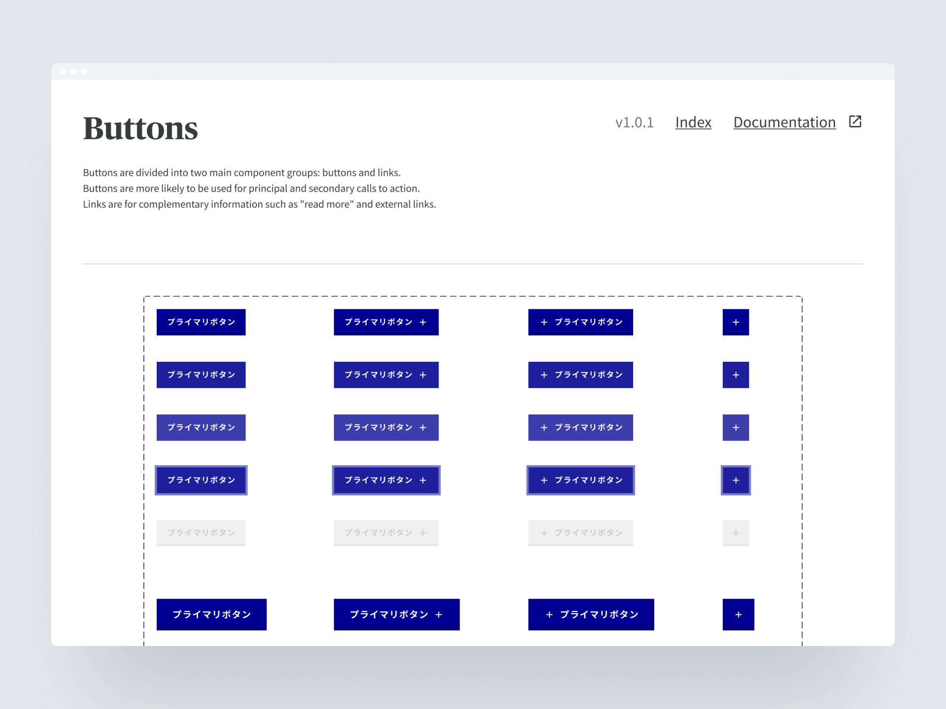
Another significant challenge was addressing the unique requirements of Japanese typography. The AXA Design System, originally optimized for Latin-based scripts, needed to be modified to accommodate Japanese characters and fonts. We worked diligently to ensure that the typography guidelines and components were suitable for Japanese text, maintaining readability and visual harmony.

How might we create a unified design foundation that accelerates development, ensures consistency, and scales across all AXA Japan digital products?
Process
1. Building the Foundation
We didn't just "translate" the global system. We rebuilt the core components to handle local realities while maintaining the global brand identity.
Examples:
- Global forms were too spacious for Japanese data density.
Rebuilt form patterns with tighter spacing and explicit borders.
- Typography scale broke with Kanji.
Redefined the type scale to ensure legibility for CJK characters.
2. Adoption
A system is useless if no one uses it. We treated the design system as a product.
Internal "Roadshows"
Hosted workshops with every product squad to demonstrate how the system speeds up work, not just design work.
Office Hours & Support
Established weekly "Design System Office Hours" to unblock anyone instantly. Changed the perception from "Design Police" to "Design Support".
3. Governance & Documentation
Created bilingual documentation that explained why, not just what. Included "Do's and Don'ts" specifically tailored to mistakes teams were currently making.
Solution
The project resulted in the creation of a comprehensive and cohesive design framework that was adopted by over 20 product teams across the organization.
By leveraging the adapted design system, product teams were able to accelerate their development cycles, reducing the time and effort required to design and implement new features and interfaces. The consistent use of pre-designed components and guidelines also contributed to a more unified and intuitive user experience across AXA Japan's digital products.
Impact
100% Adoption in new projects
Reduced design/development costs
Foundation for digital expansion
Improved accessibility compliance
Aligned Global Brand & Local Needs
AXA Japan Design System
2020
Building a scalable foundation for digital transformation across insurance products
Context
AXA Japan's digital ecosystem was fragmented across multiple insurance products (life, health, travel, pet insurance), each with inconsistent design patterns, duplicated components, and no shared standards. This created inefficiency in development, inconsistent user experiences, and scalability issues as the company expanded its digital offerings.
I led the creation of AXA Japan's first comprehensive design system—establishing a unified component library, design principles, and documentation that would scale across all digital products while maintaining brand consistency and accessibility standards.
Problem
One of the primary challenges we faced during this project was navigating the cultural differences between the global AXA Design System and the expectations of Japanese users. We had to strike a delicate balance between maintaining the core identity of AXA's brand and adapting the design elements to resonate with the local audience.
Another significant challenge was addressing the unique requirements of Japanese typography. The AXA Design System, originally optimized for Latin-based scripts, needed to be modified to accommodate Japanese characters and fonts. We worked diligently to ensure that the typography guidelines and components were suitable for Japanese text, maintaining readability and visual harmony.
How might we create a unified design foundation that accelerates development, ensures consistency, and scales across all AXA Japan digital products?
Process
1. Building the Foundation
We didn't just "translate" the global system. We rebuilt the core components to handle local realities while maintaining the global brand identity.
Examples:
- Global forms were too spacious for Japanese data density.
Rebuilt form patterns with tighter spacing and explicit borders.
- Typography scale broke with Kanji.
Redefined the type scale to ensure legibility for CJK characters.
2. Adoption
A system is useless if no one uses it. We treated the design system as a product.
Internal "Roadshows"
Hosted workshops with every product squad to demonstrate how the system speeds up work, not just design work.
Office Hours & Support
Established weekly "Design System Office Hours" to unblock anyone instantly. Changed the perception from "Design Police" to "Design Support".
3. Governance & Documentation
Created bilingual documentation that explained why, not just what. Included "Do's and Don'ts" specifically tailored to mistakes teams were currently making.
Solution
The project resulted in the creation of a comprehensive and cohesive design framework that was adopted by over 20 product teams across the organization.
By leveraging the adapted design system, product teams were able to accelerate their development cycles, reducing the time and effort required to design and implement new features and interfaces. The consistent use of pre-designed components and guidelines also contributed to a more unified and intuitive user experience across AXA Japan's digital products.
Impact
100% Adoption in new projects
Reduced design/development costs
Foundation for digital expansion
Improved accessibility compliance
Aligned Global Brand & Local Needs