Picta Global
2025
Redesigning the product catalog experience for Picta's photo printing app, serving 16M+ users across US
Context
Project Status: This is an ongoing project (October 2025 - Present). The research and design system foundation have been completed, with implementation currently in progress across our web and mobile platforms.
Pictarine builds photo printing apps partnering with major US retailers. Users can print photos and pick them up in 1 hour at 10,000+ stores or home delivery. The Global Experience squad was tasked with redesigning the catalog to improve product discovery and conversion.
Team Context: I work within the "Experience Globale" squad alongside:
- a Product Manager
- a User Researcher
- a Creative Lead
- a Marketing team
- a Development team
Problem
Our analytics and user research revealed that our current catalog experience was failing to serve distinct user behavioral segments, creating friction across the entire purchase journey.
The pain points :
- Slow path to purchase for High-Intent Users
- Poor discovery and navigation structure
- Product organization was confusing
- Inability to compare products efficiently
- Hidden costs and lack of pricing transparency
- No guidance for First-Time or Goal-Oriented Users

How might we create an adaptive catalog experience that serves users whether they need speed, discovery, comparison, transparency, or guidance?
Process
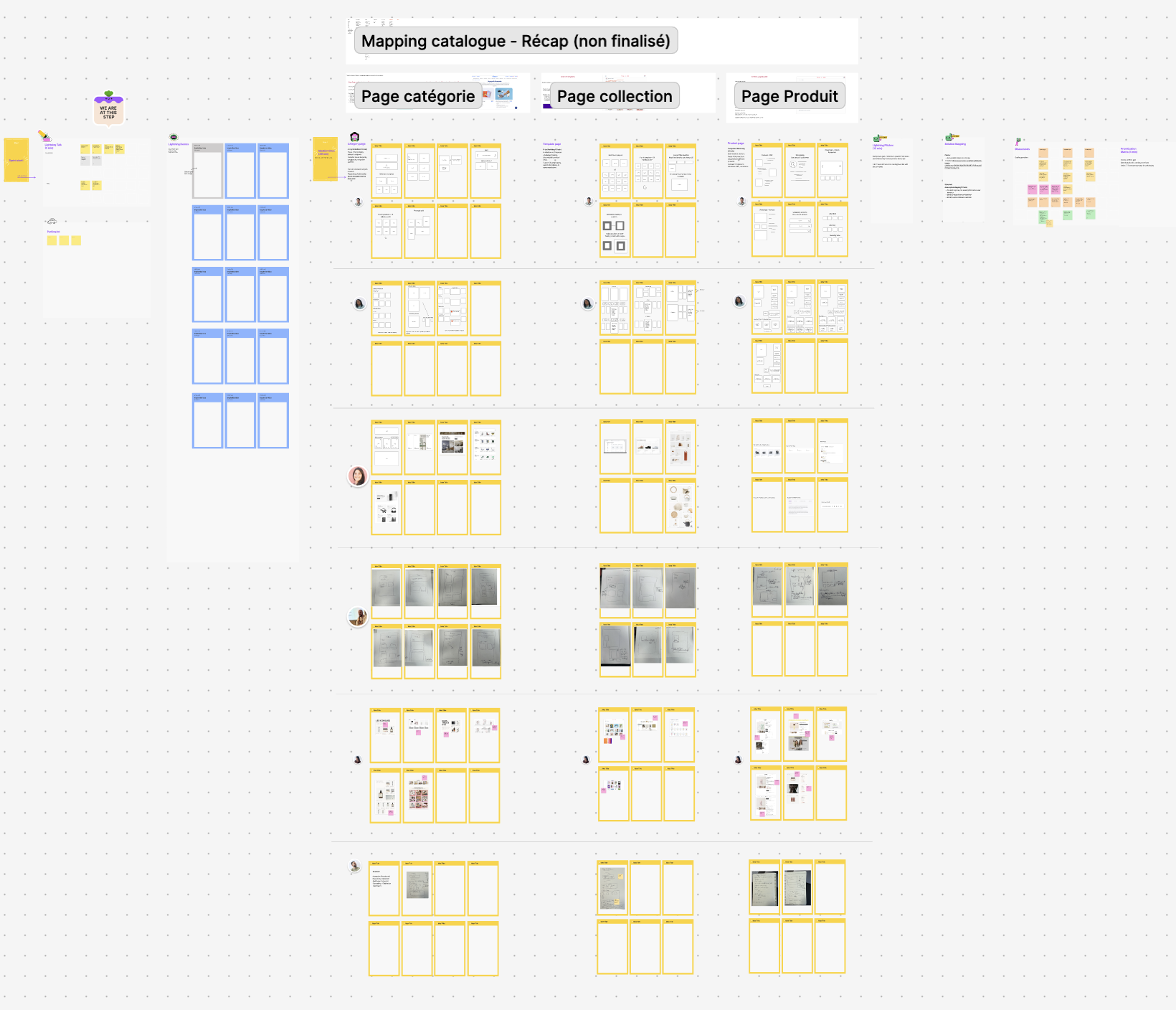
Research & Discovery
Methodology:
- Quantitative: Analytics analysis tracking time-to-product, pages viewed, scroll depth, conversion by source, cart abandonment points
- Qualitative: User interviews, usability testing, competitive analysis, stakeholder workshops
- Framework: Jobs-To-Be-Done methodology to understand user motivations
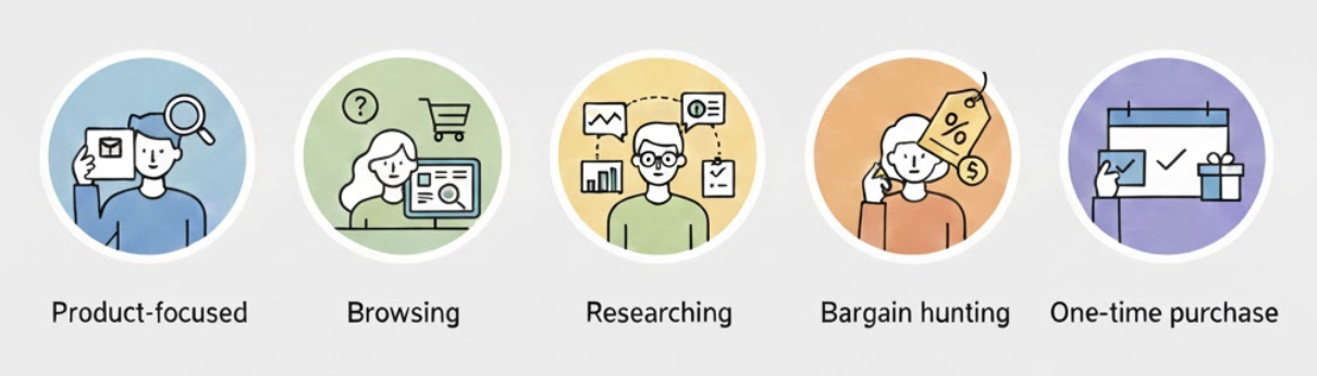
Key Insight: Users weren't failing one experience—they needed five different experiences. We identified distinct behavioral segments:
Solution
- Adaptive homepage entry points: multiple pathways allowing users to self-select their journey:
- Enhanced product listing (Mobile-First)
- In-page comparison capability
- Transparent pricing components
- Goal-based navigation
Highlight
We implemented an Occasion-first Navigation to serve high-uncertainty users.
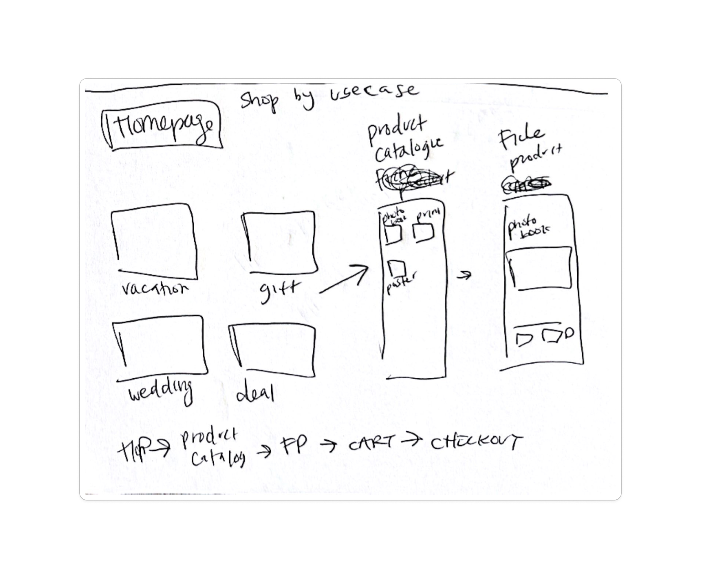
-> 9/12 users used occasion cards in testing
Impact
Status: Phase 2 implementation (full rollout Q1 2025)
Early Indicators (User Interview):
- Time to product page reduced (product-focused entry points)
- Better understanding of offers and pricing
Tracking Metrics:
- Time from homepage to product page
- Product pages viewed
- Conversion rate by segment
- Mobile/desktop parity
Picta Global
2025
Redesigning the product catalog experience for Picta's photo printing app, serving 16M+ users across US
Context
Project Status: This is an ongoing project (October 2025 - Present). The research and design system foundation have been completed, with implementation currently in progress across our web and mobile platforms.
Pictarine builds photo printing apps partnering with major US retailers. Users can print photos and pick them up in 1 hour at 10,000+ stores or home delivery. The Global Experience squad was tasked with redesigning the catalog to improve product discovery and conversion.
Team Context: I work within the "Experience Globale" squad alongside:
- a Product Manager
- a User Researcher
- a Creative Lead
- a Marketing team
- a Development team
Problem
Our analytics and user research revealed that our current catalog experience was failing to serve distinct user behavioral segments, creating friction across the entire purchase journey.
The pain points :
- Slow path to purchase for High-Intent Users
- Poor discovery and navigation structure
- Product organization was confusing
- Inability to compare products efficiently
- Hidden costs and lack of pricing transparency
- No guidance for First-Time or Goal-Oriented Users
How might we create an adaptive catalog experience that serves users whether they need speed, discovery, comparison, transparency, or guidance?
Process
Research & Discovery
Methodology:
- Quantitative: Analytics analysis tracking time-to-product, pages viewed, scroll depth, conversion by source, cart abandonment points
- Qualitative: User interviews, usability testing, competitive analysis, stakeholder workshops
- Framework: Jobs-To-Be-Done methodology to understand user motivations
Key Insight: Users weren't failing one experience—they needed five different experiences. We identified distinct behavioral segments:
Solution
- Adaptive homepage entry points: multiple pathways allowing users to self-select their journey:
- Enhanced product listing (Mobile-First)
- In-page comparison capability
- Transparent pricing components
- Goal-based navigation
Highlight
We implemented an Occasion-first Navigation to serve high-uncertainty users.
-> 9/12 users used occasion cards in testing
Impact
Status: Phase 2 implementation (full rollout Q1 2025)
Early Indicators (User Interview):
- Time to product page reduced (product-focused entry points)
- Better understanding of offers and pricing
Tracking Metrics:
- Time from homepage to product page
- Product pages viewed
- Conversion rate by segment
- Mobile/desktop parity