Store Selection
2025
Redesigned the store selection experience for photo pickup, using user research and A/B testing to find the right way to communicate store reliability.
Context
Problem
Picta app lets users pick up photos in 1 hour at partners stores. We wanted to highlight "Top Choice" stores (reliable, low cancellation).
Existing Design Failed
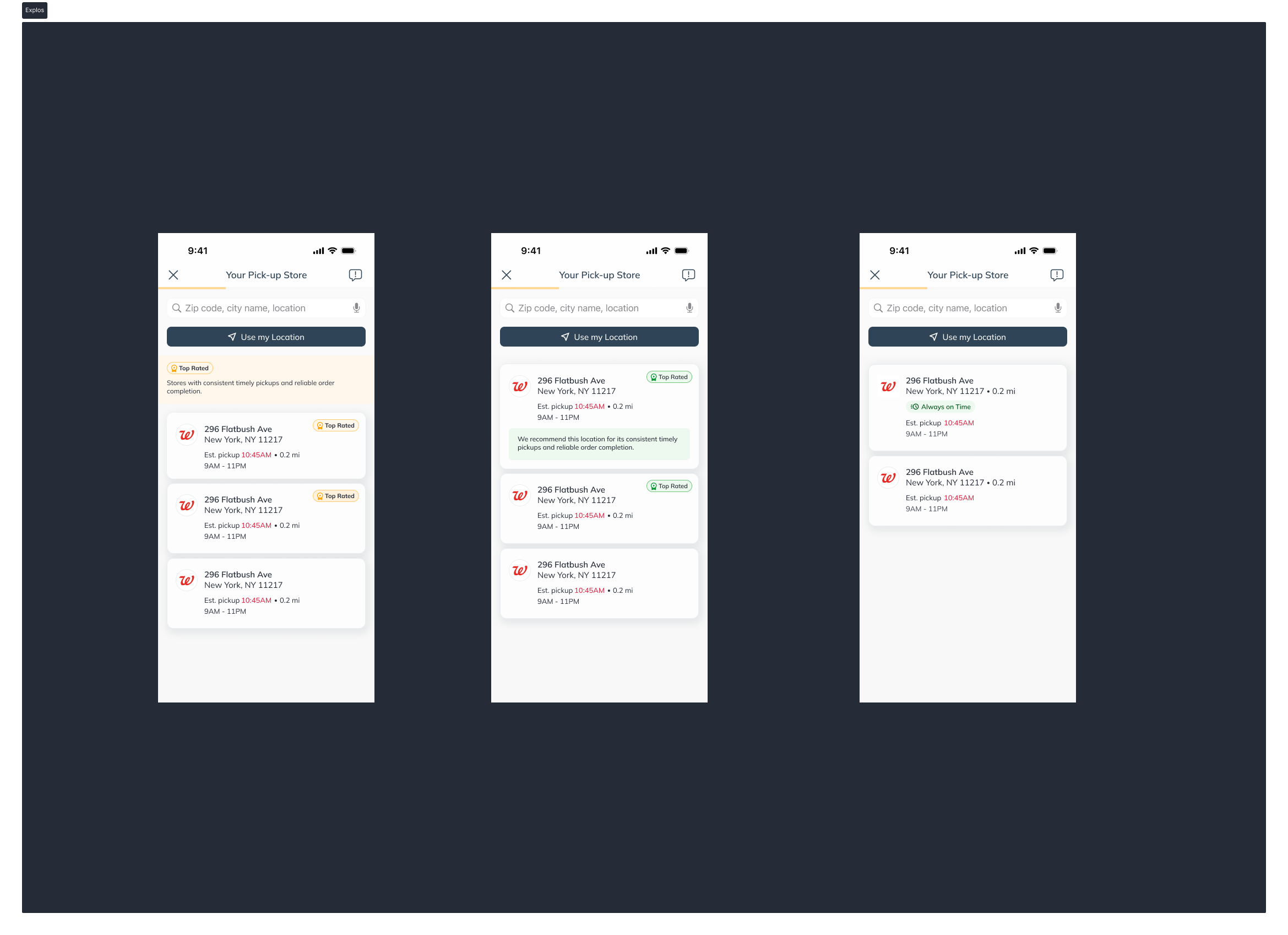
The "Top Choice" tag with a star icon was ignored. Users didn't understand it ("Top choice for what?") or confused it with user ratings.

How do we communicate store reliability in a way users understand and trust?
Process
Testing Hypotheses
The Variants
We tested 3 labels with 12 users via Lyssna (unmoderated).
Key Findings
- Benefit > Abstract: Users want to know *why* it's good (it's on time), not that it is "top".
- Proximity is King: Distance is still the #1 factor. The badge must be a secondary confirmation, not a primary filter.
Solution
We implemented the "Always on Time" badge. It appears only on qualifying stores, positioned next to the store name but visually secondary to the distance.
Hierarchy: 1. Distance (Primary) → 2. Reliability Badge (Secondary) → 3. Store Details.
Impact
- Better activation
- Better understanding
- Less refund and complains
Store Selection
2025
Redesigned the store selection experience for photo pickup, using user research and A/B testing to find the right way to communicate store reliability.
Context
Problem
Picta app lets users pick up photos in 1 hour at partners stores. We wanted to highlight "Top Choice" stores (reliable, low cancellation).
Existing Design Failed
The "Top Choice" tag with a star icon was ignored. Users didn't understand it ("Top choice for what?") or confused it with user ratings.
How do we communicate store reliability in a way users understand and trust?
Process
Testing Hypotheses
The Variants
We tested 3 labels with 12 users via Lyssna (unmoderated).
Key Findings
- Benefit > Abstract: Users want to know *why* it's good (it's on time), not that it is "top".
- Proximity is King: Distance is still the #1 factor. The badge must be a secondary confirmation, not a primary filter.
Solution
We implemented the "Always on Time" badge. It appears only on qualifying stores, positioned next to the store name but visually secondary to the distance.
Hierarchy: 1. Distance (Primary) → 2. Reliability Badge (Secondary) → 3. Store Details.
Impact
- Better activation
- Better understanding
- Less refund and complains